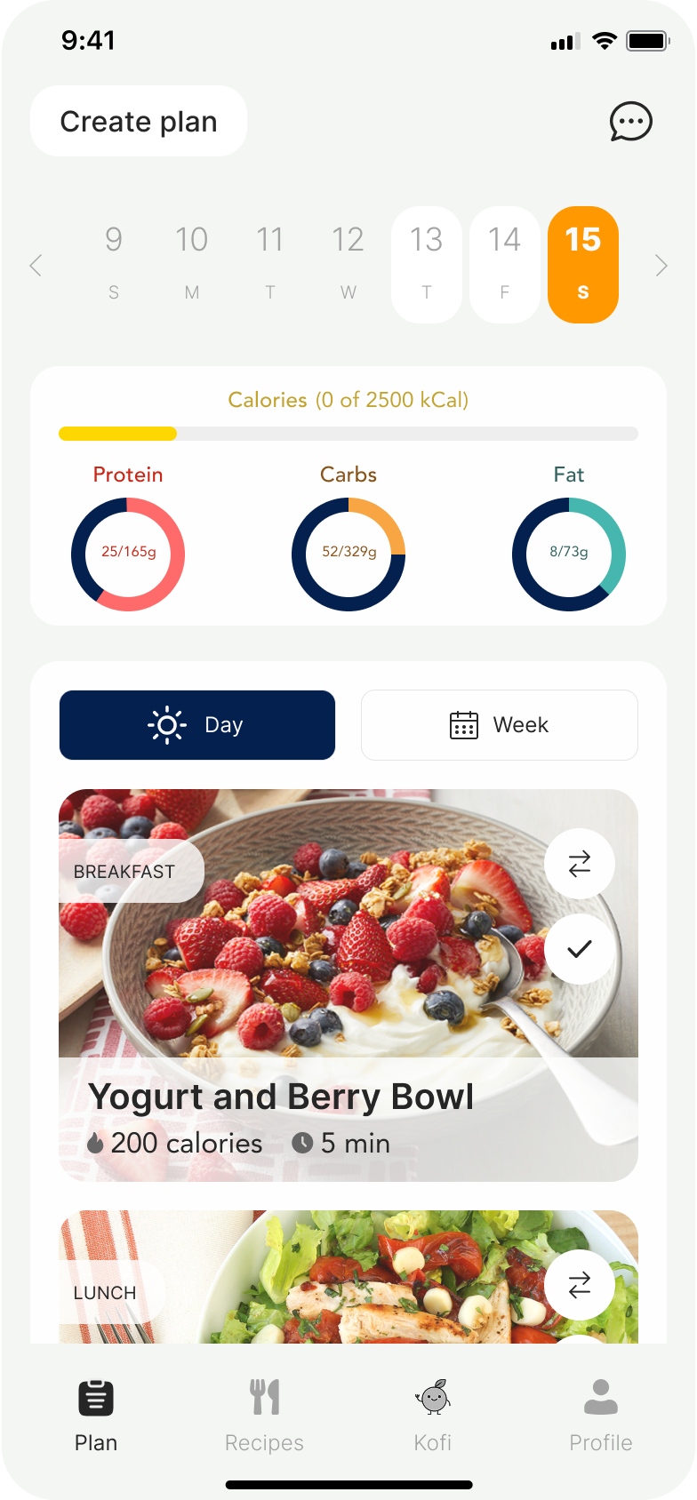
MealMatch AI is a meal planning app that uses AI to take the decision out of what to eat. Tell it your goals, budget, and food preferences — it builds your week.
Meal planning is broken by decision fatigue.
The team was ready to start building. I pushed for research first. If we were going to build the right thing, we needed data behind the problem.
We surveyed people about how they plan meals and buy groceries. Decision fatigue was the clear winner. People didn't know what to cook and didn't have the energy to think about it. AI meal suggestions was the most requested feature by far.
Earning the right to ask personal questions.
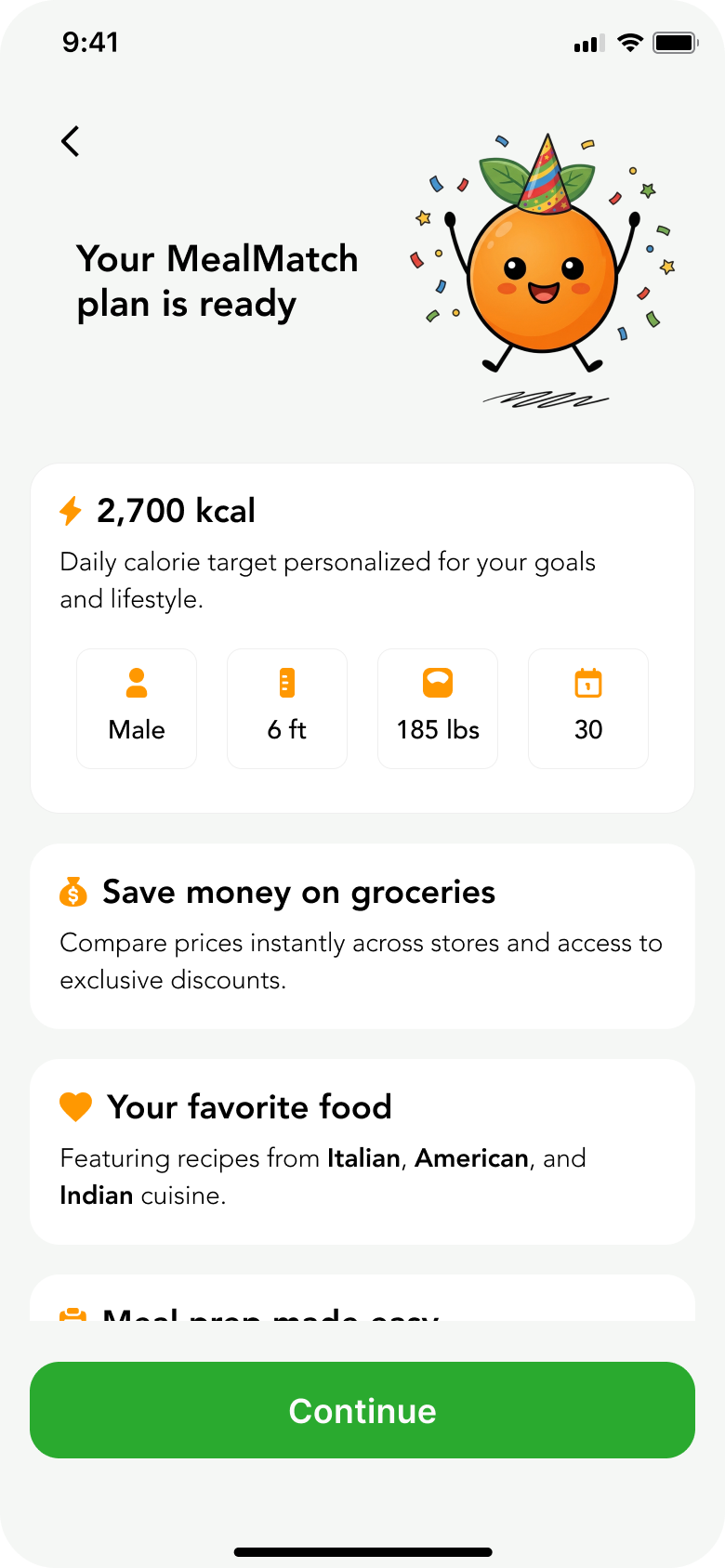
We ordered the onboarding to make people feel comfortable first. Easy stuff like goals and food preferences up front, personal details like height, weight, and biological sex at the end.
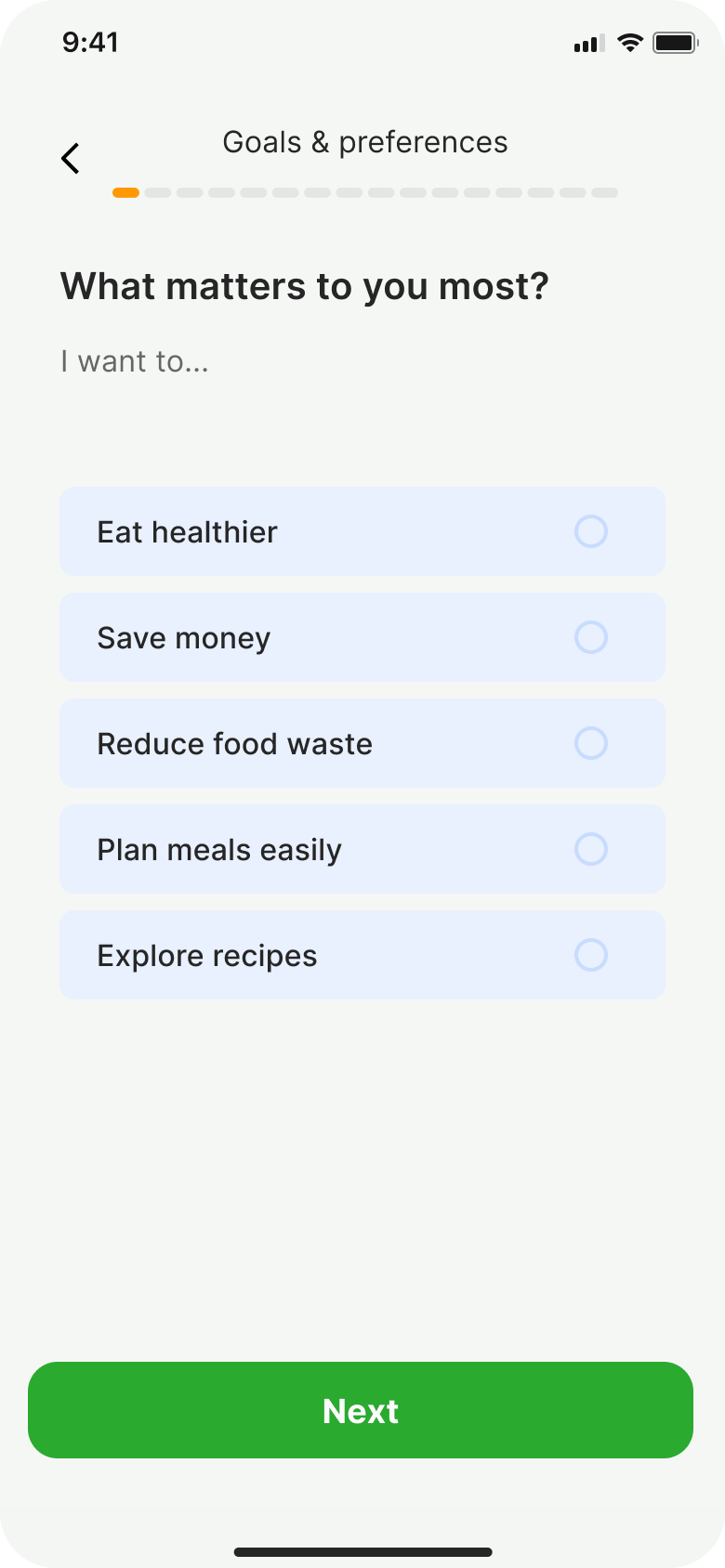
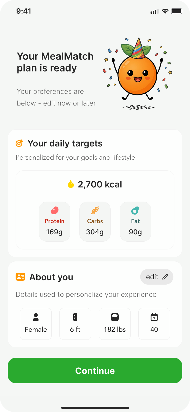
This follows the progressive disclosure principle. Start with low-stakes questions to build investment before asking for anything personal. Research shows each additional personal field increases drop-off. By placing height, weight, and biological sex at the very end, users are already invested in the process.
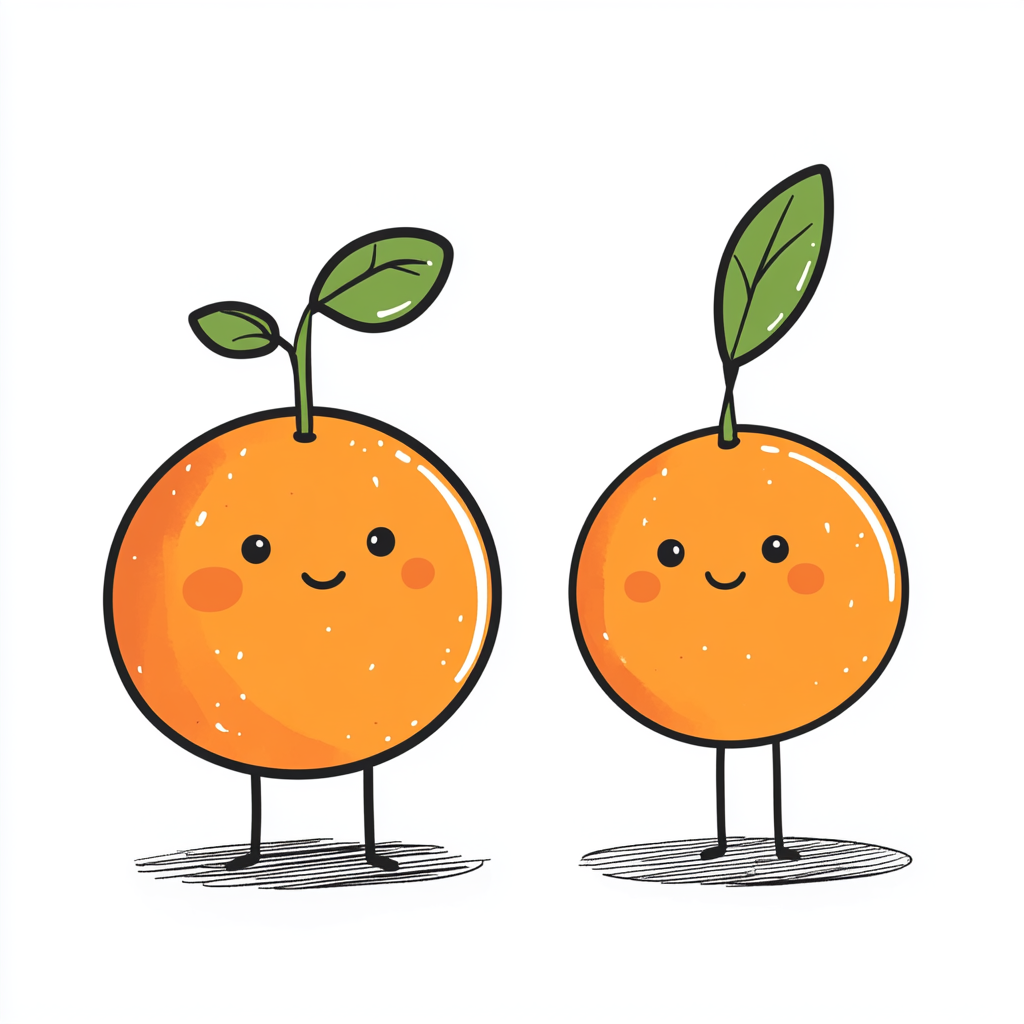
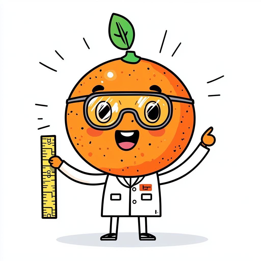
500+ iterations. One consistent character.
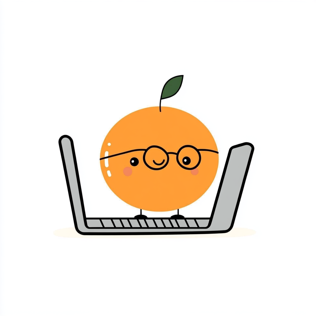
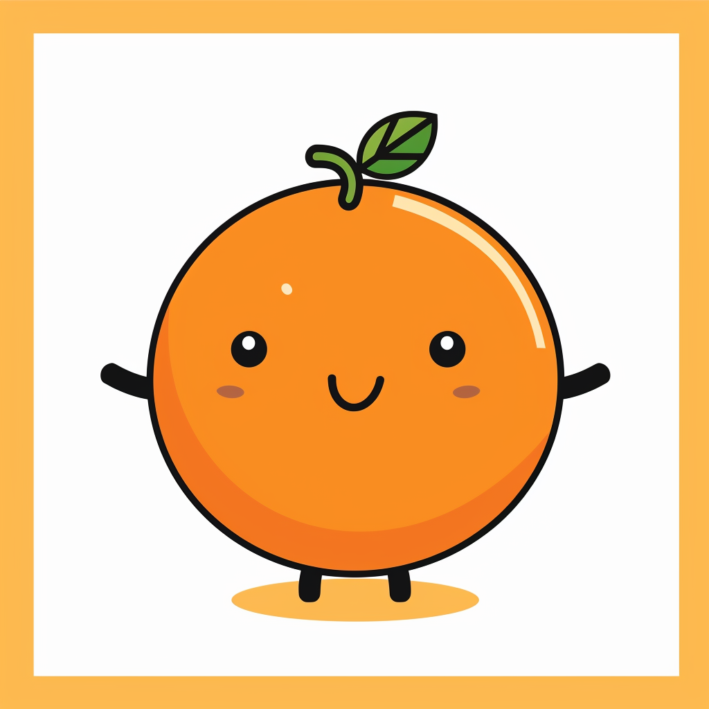
Kofi is MealMatch's AI character. He started as a founder concept, and getting him consistent across every pose in the app became one of the hardest design problems I've solved.
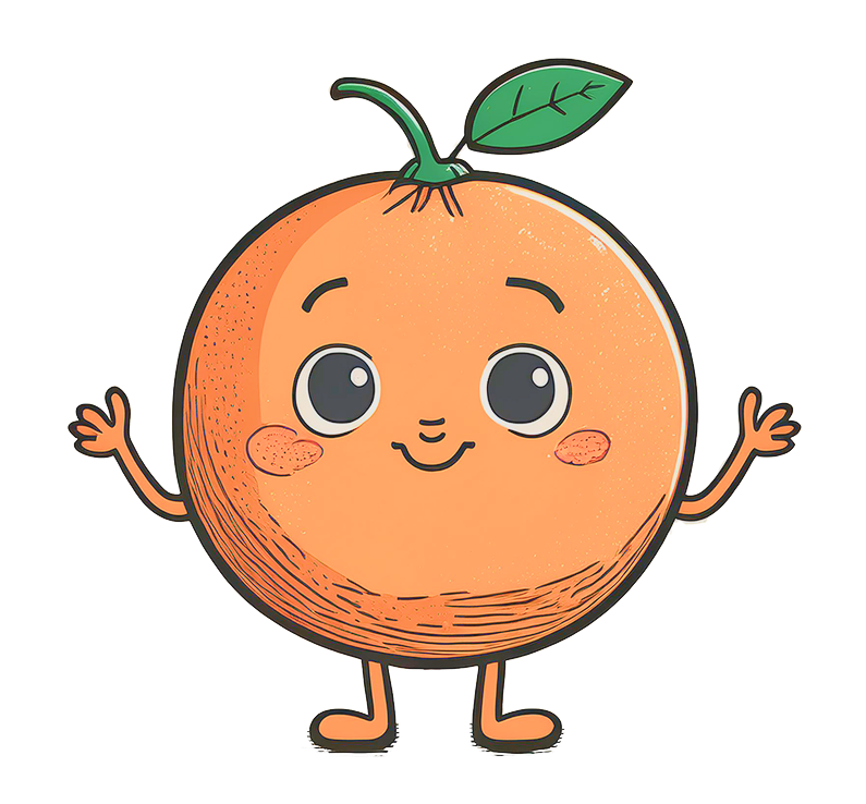


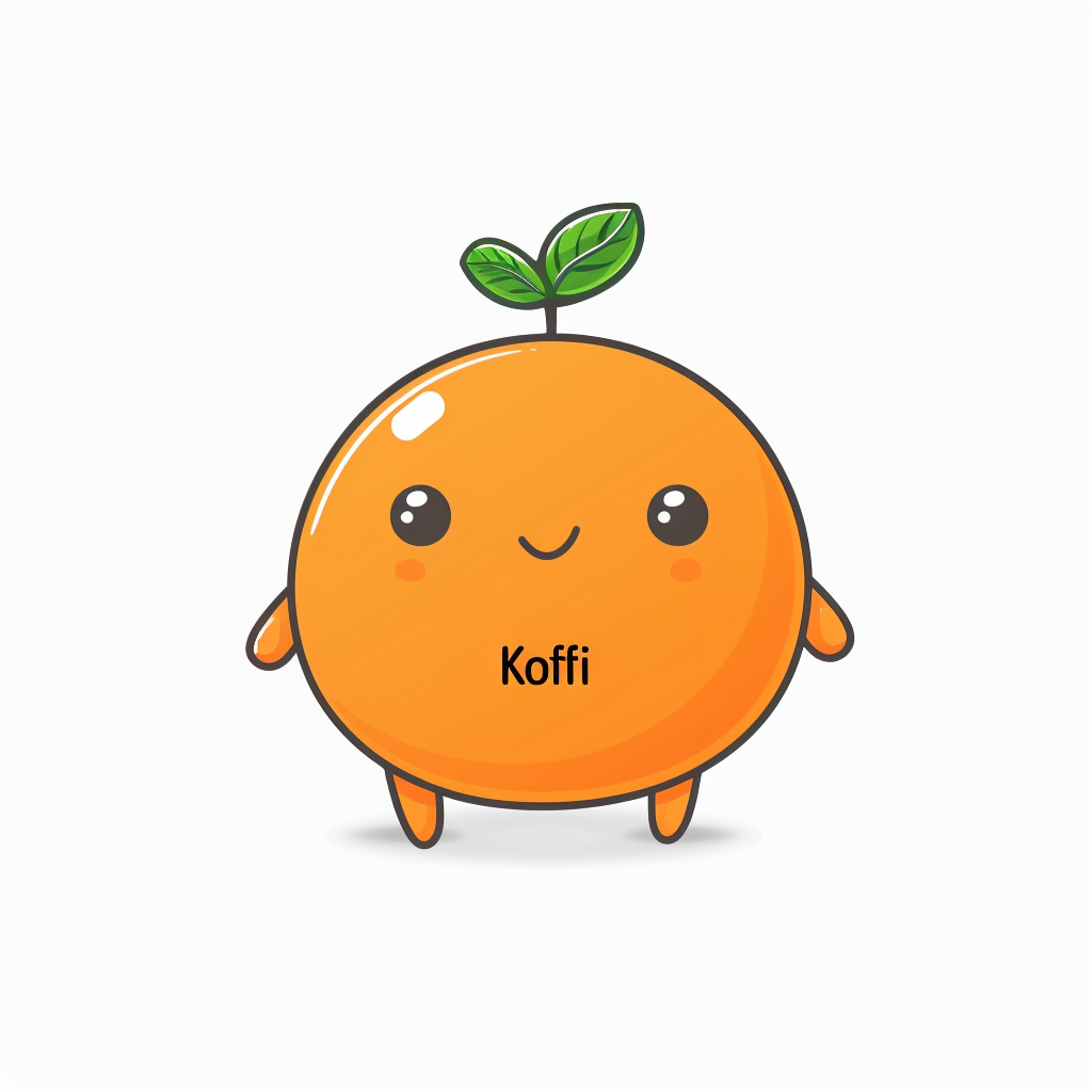
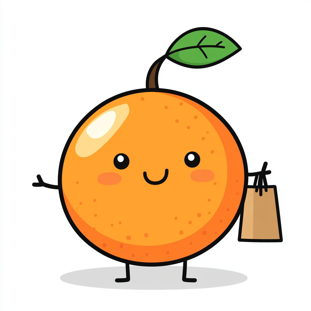
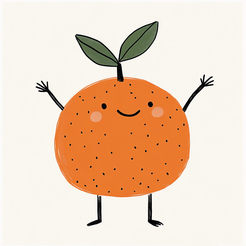
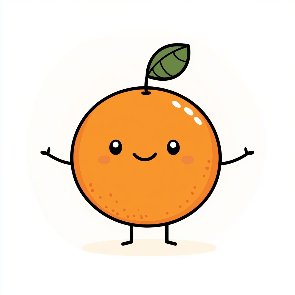
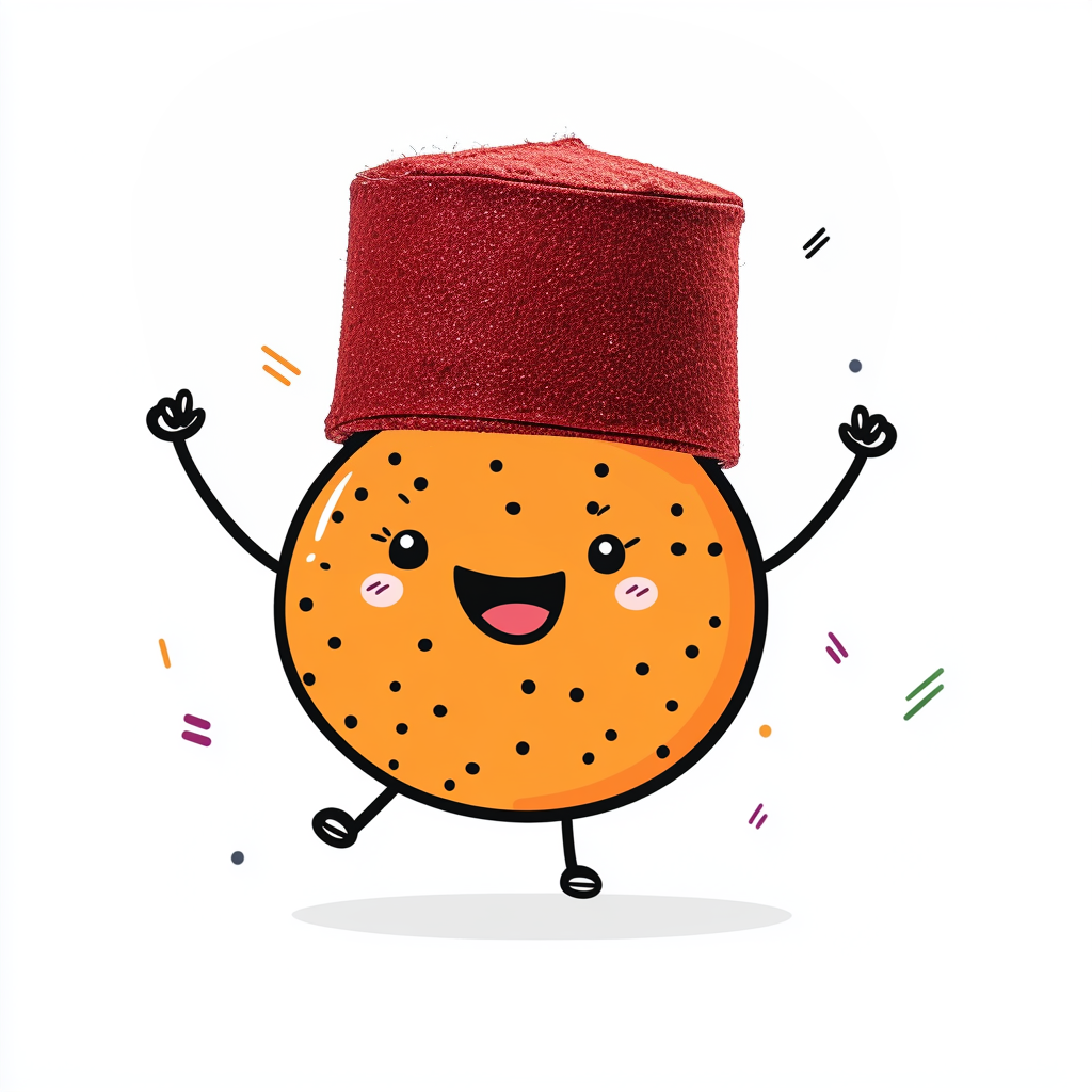
The Original.
The founder's original concept. It worked as a one-off but we needed Kofi in multiple poses across the app.
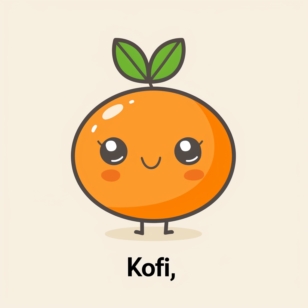
ChatGPT.
We tried ChatGPT first. The results were too detailed and every output looked like a different character.
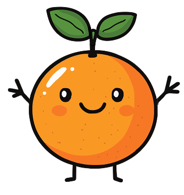
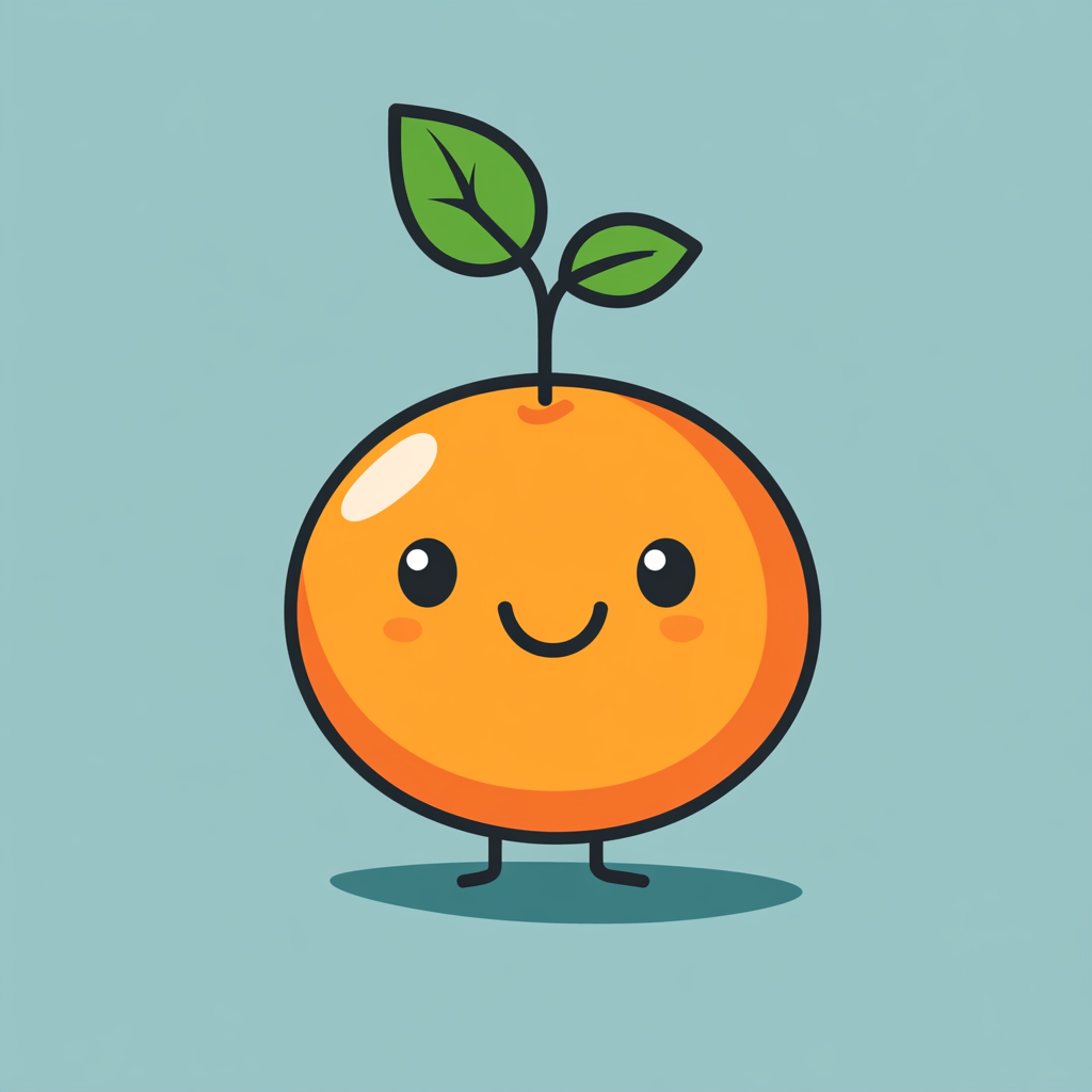
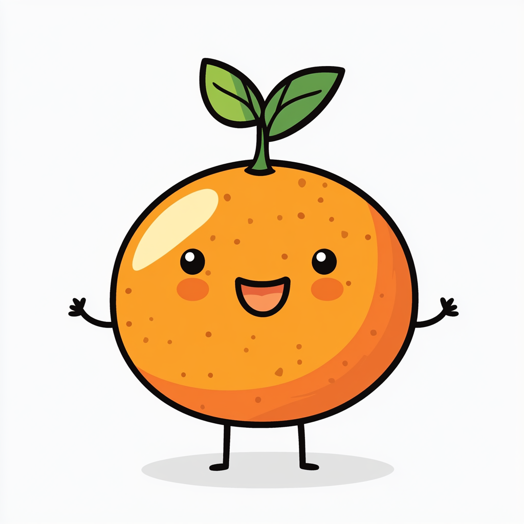
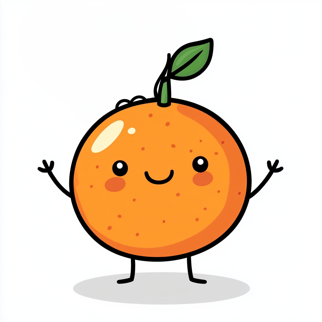
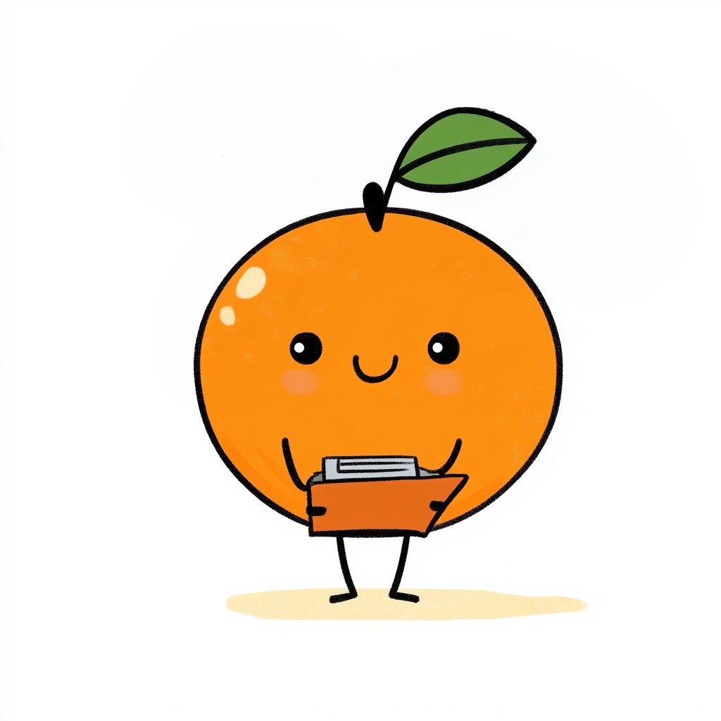
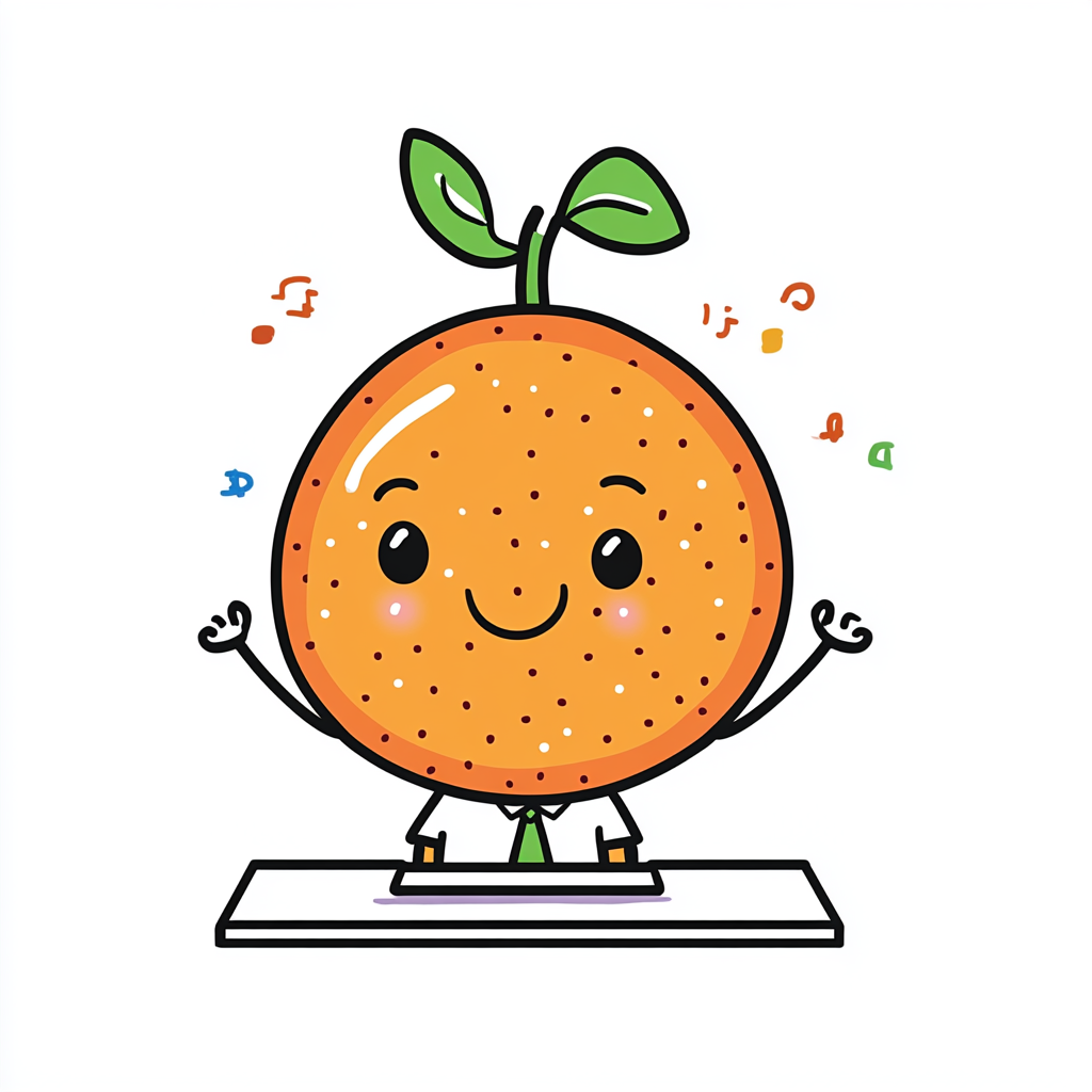
Stripped Back.
I simplified the character. Bold lines, flat colours, no extra detail. This became the version everything else was measured against.
The Midjourney Grind.
500+ attempts to get the simplified version into different poses. Most of them didn't match. The wall shows the scale of it.

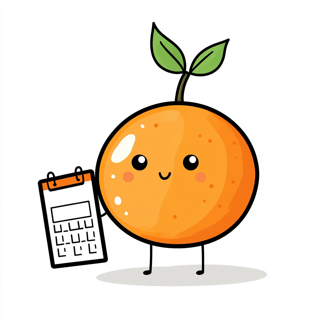
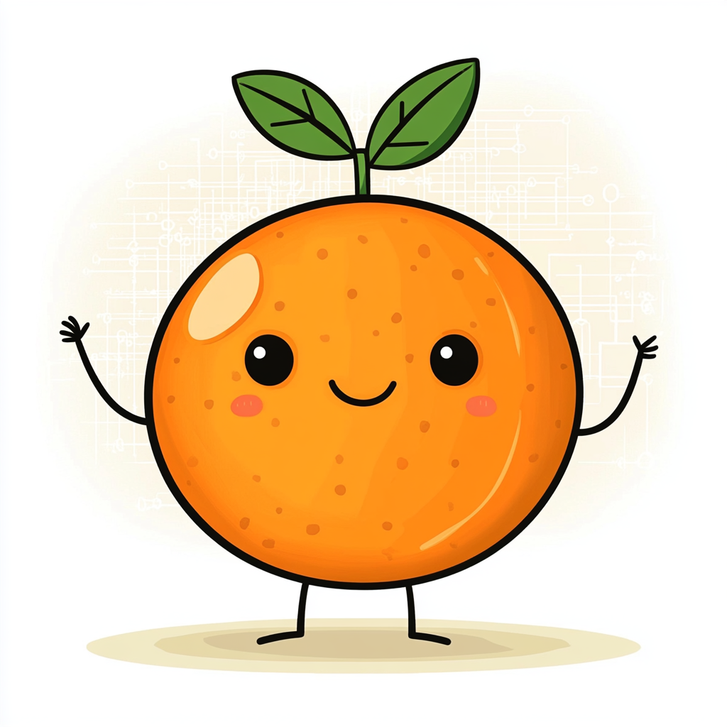
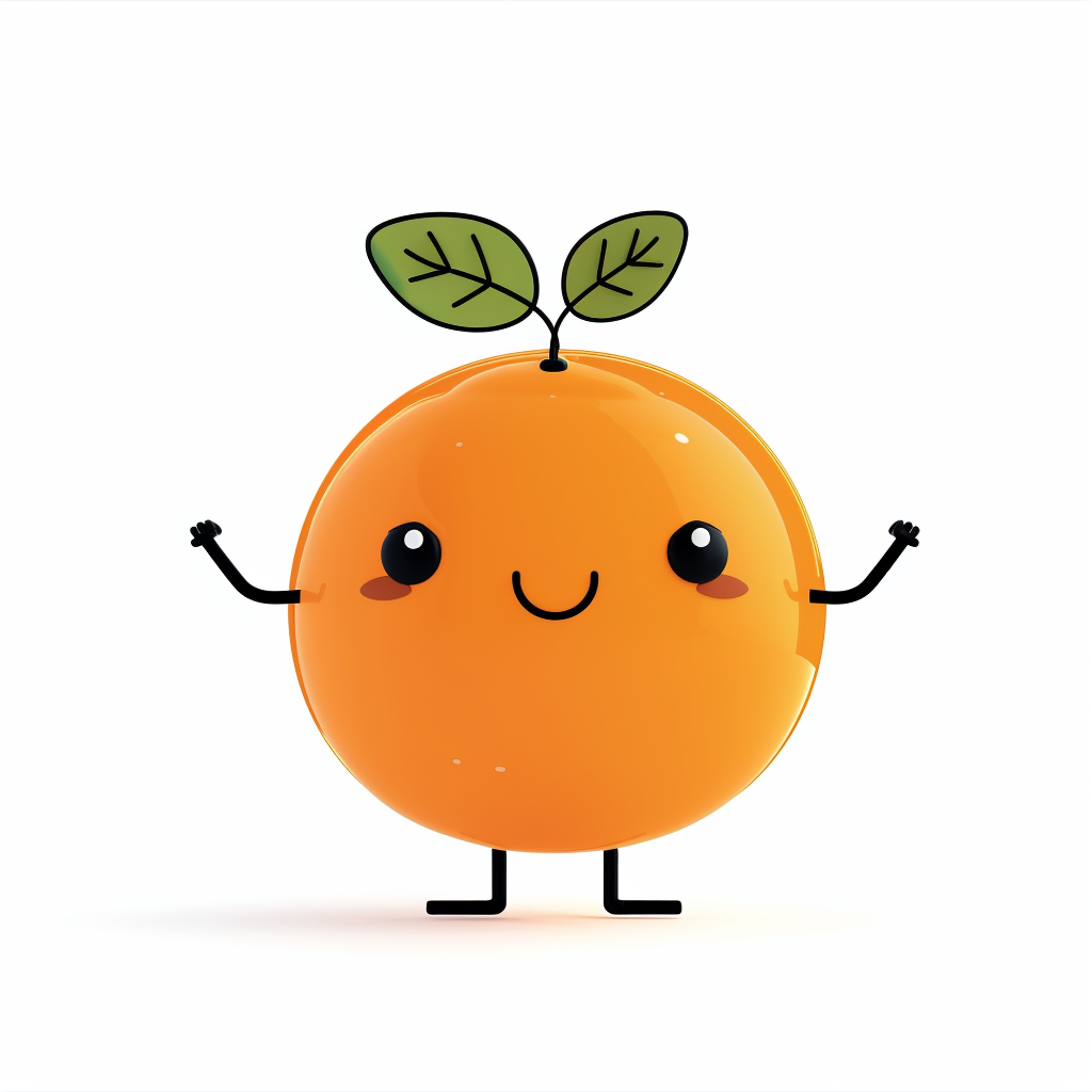
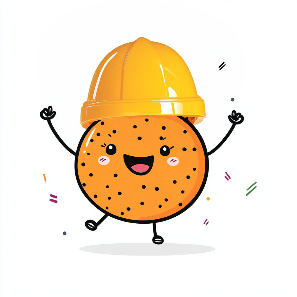
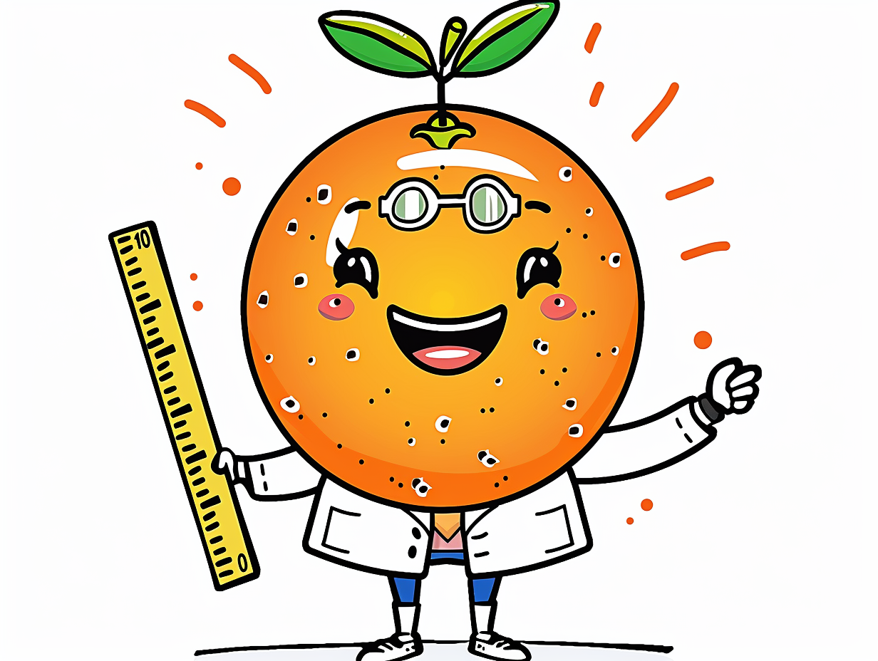
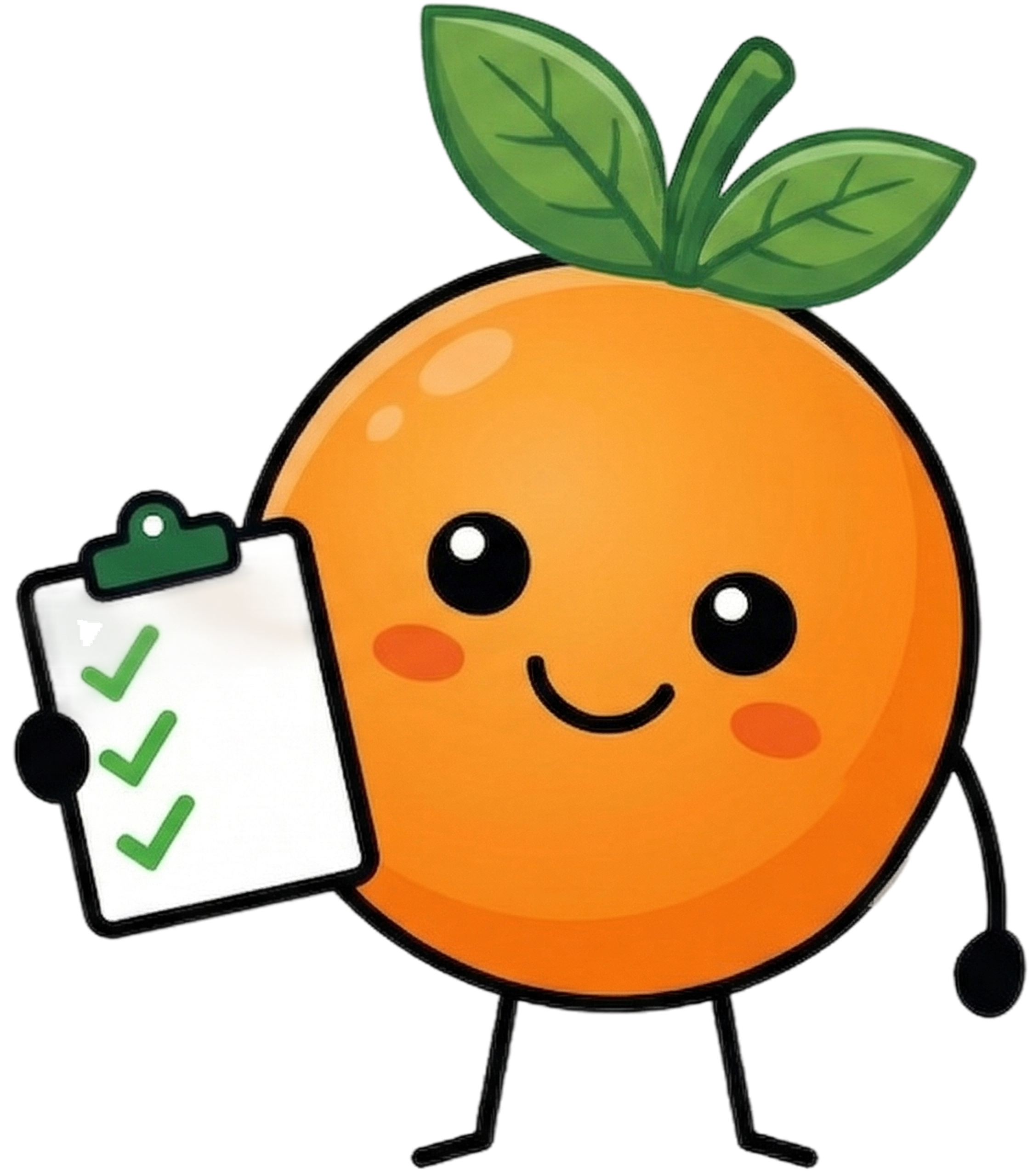
Cracked It.
Switched to Google Imagen when it became available. The tool finally made consistency possible. Same proportions, same style, every pose.
Making the call under pressure.
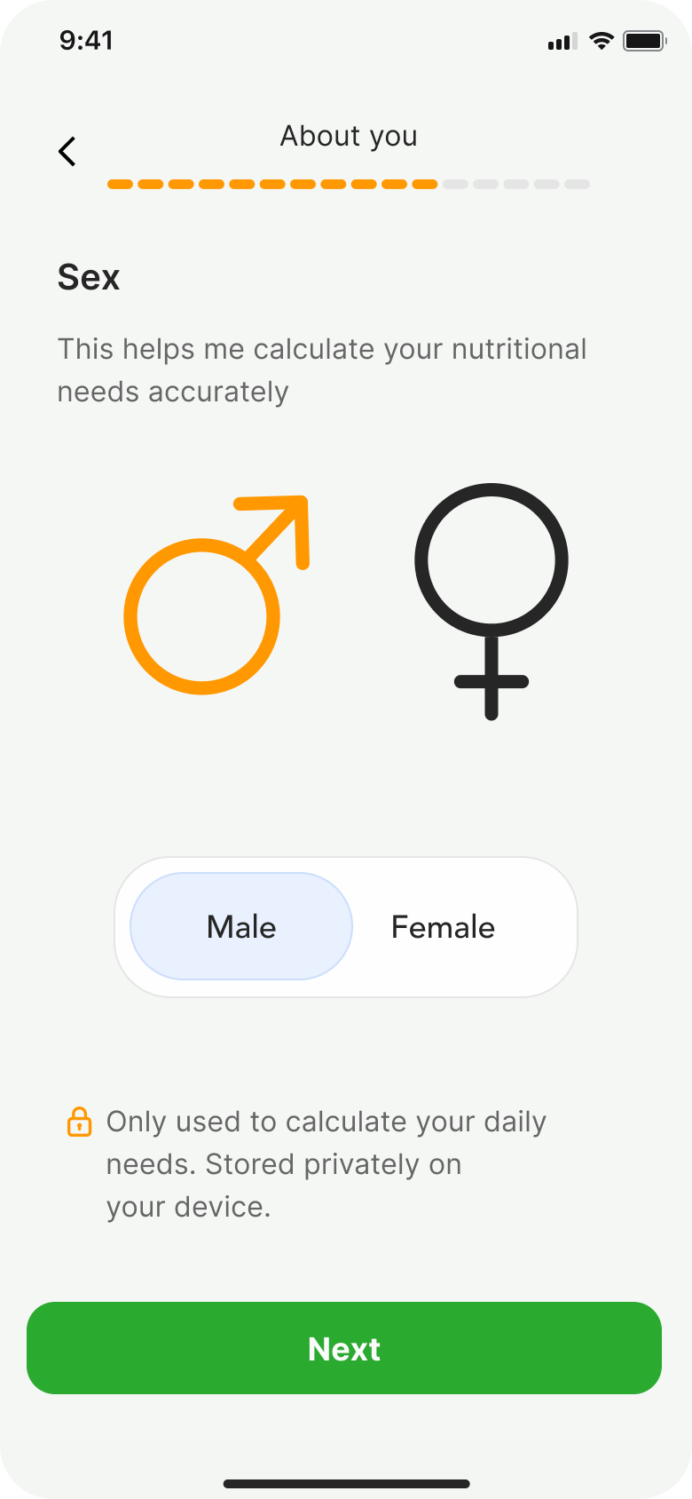
Biological sex vs. gender.
A teammate suggested changing 'biological sex' to 'gender' in the onboarding. I pushed back because our calorie calculations depend on physiology, not identity. Get it wrong and the AI gives inaccurate numbers.
Biological sex and gender identity aren't interchangeable. Calorie calculations use basal metabolic rate, which depends on physiology. Using gender instead of sex would produce inaccurate recommendations for some users.
Was the onboarding too long?
During a team review, several stakeholders flagged the onboarding as too long, raising concerns about drop-off. So we tested it with 5 users.
Rather than cutting screens based on internal opinion, we let users decide. The data backed the original length. Every screen collected data the AI needed to personalise recommendations.
Turning a limit into a win.
Hitting a paywall feels like a punishment. We framed the free tier limit as a milestone of progress rather than a dead end.
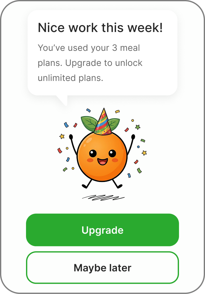
Most apps treat limits as a wall. We used Kofi and celebratory language to frame it as progress, making the upgrade feel like a reward rather than a restriction.
Testing the prototype.
We tested the onboarding prototype and found three major friction points.
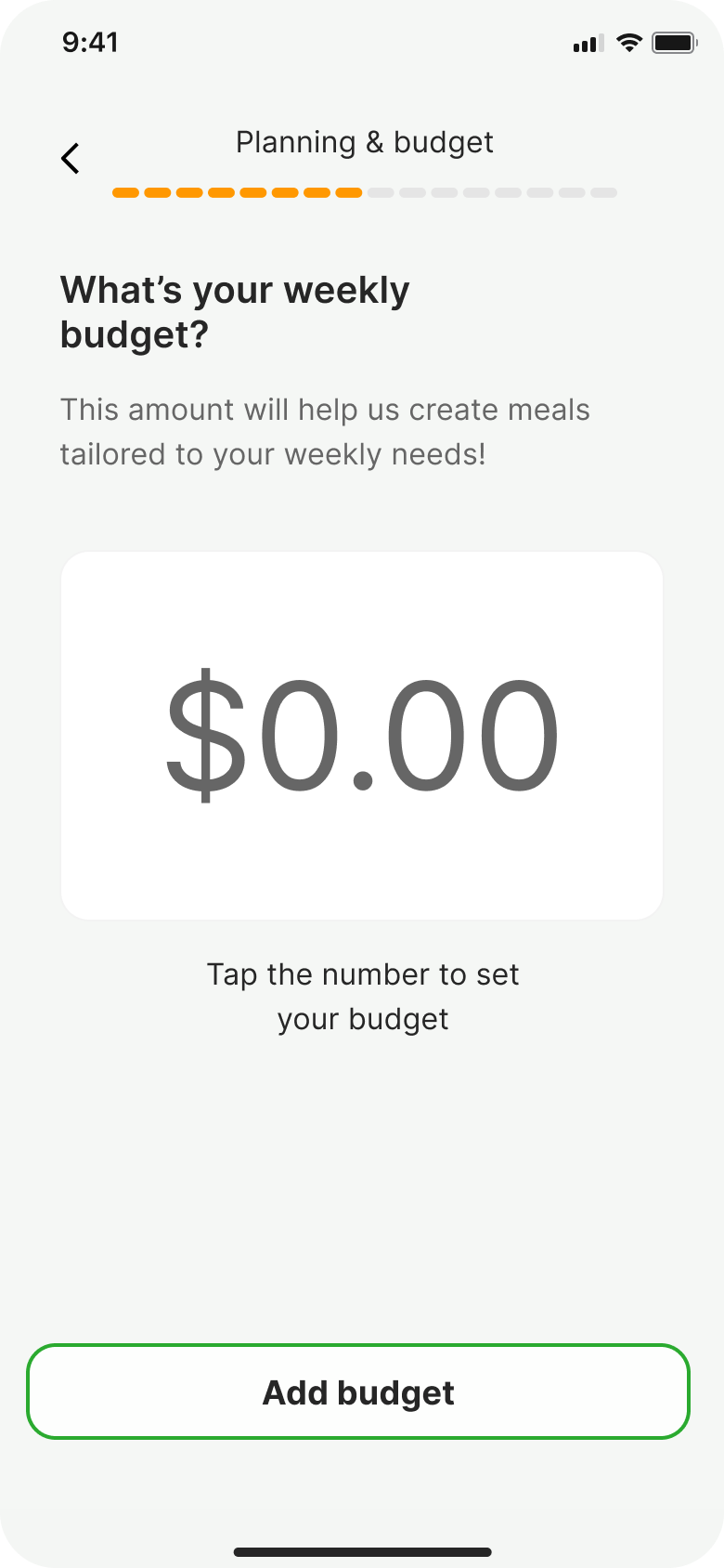
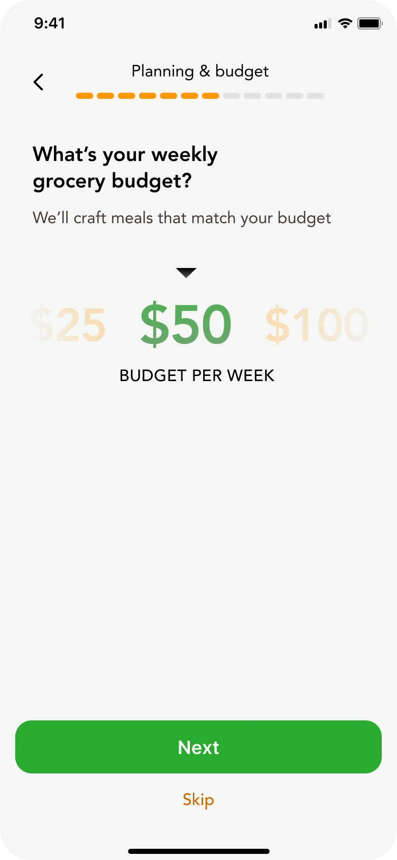
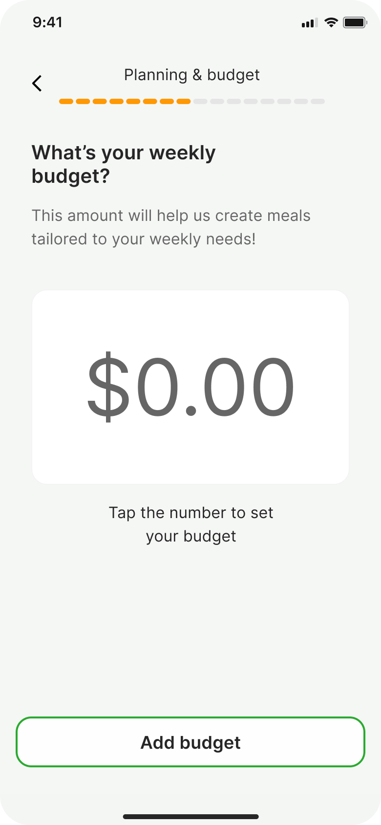
The budget input.
Users expected to type a number, not scroll through options.
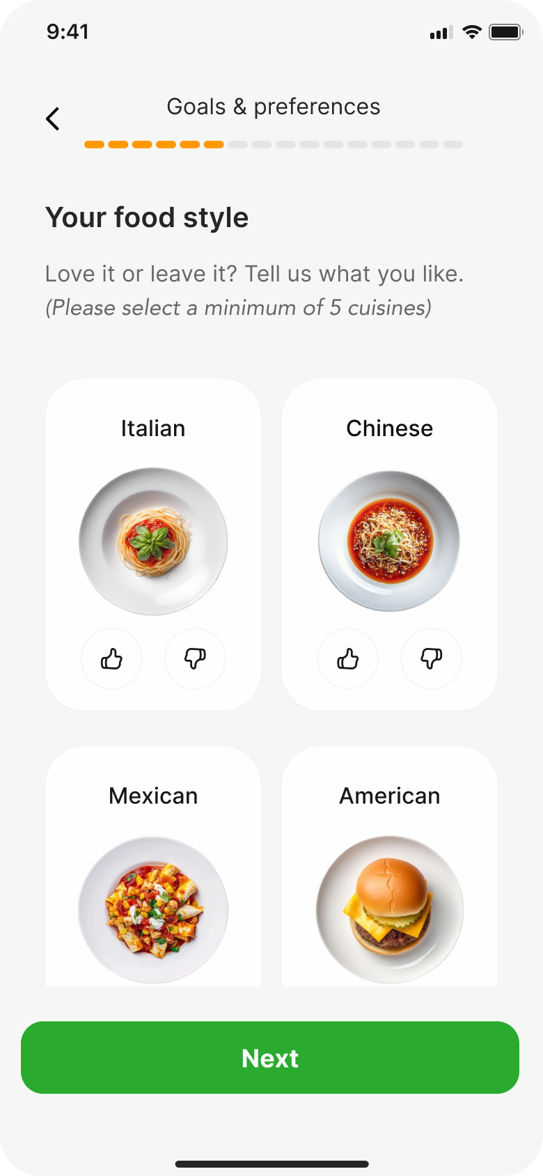
Cuisine selection.
Three choices felt limiting. Users wanted to express what they loved and what they didn't.
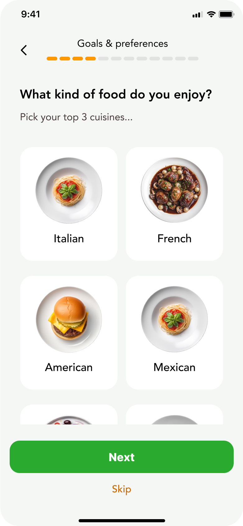

Added like/dislike so the AI knows what you actually want, not just what you picked from a list.
Swapped the typeface. The original didn't have a commercial licence.
Increased the minimum from 3 to 5 cuisines. More data means better AI recommendations.
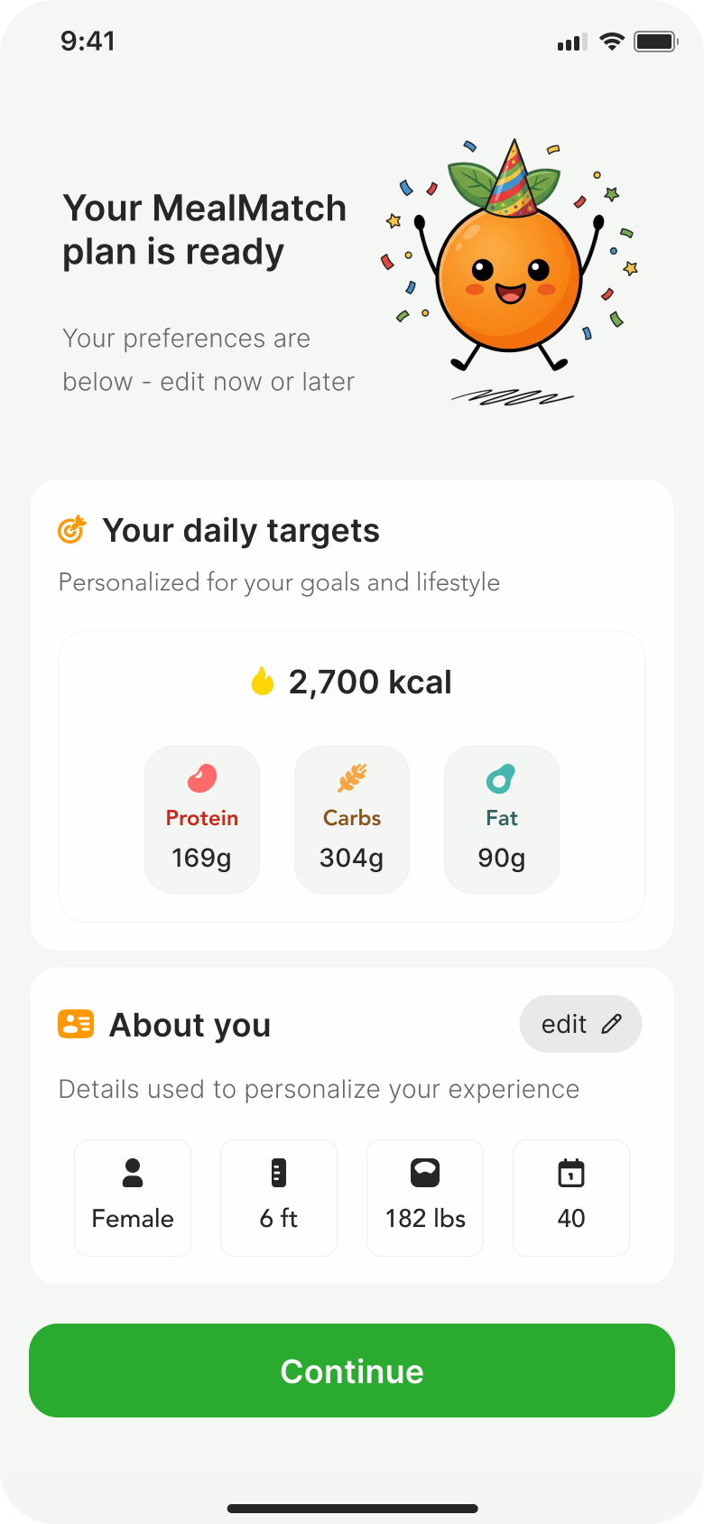
Plan review.
The summary screen listed everything without structure. We grouped it into clear sections and added an edit option so people could check their details before continuing.
A design system, built from zero.
I built the design system from scratch. A token-based color system with primitives and semantic layers, plus a component library tied to all of it. Everything references the token system, so changing a value in one place updates it everywhere.
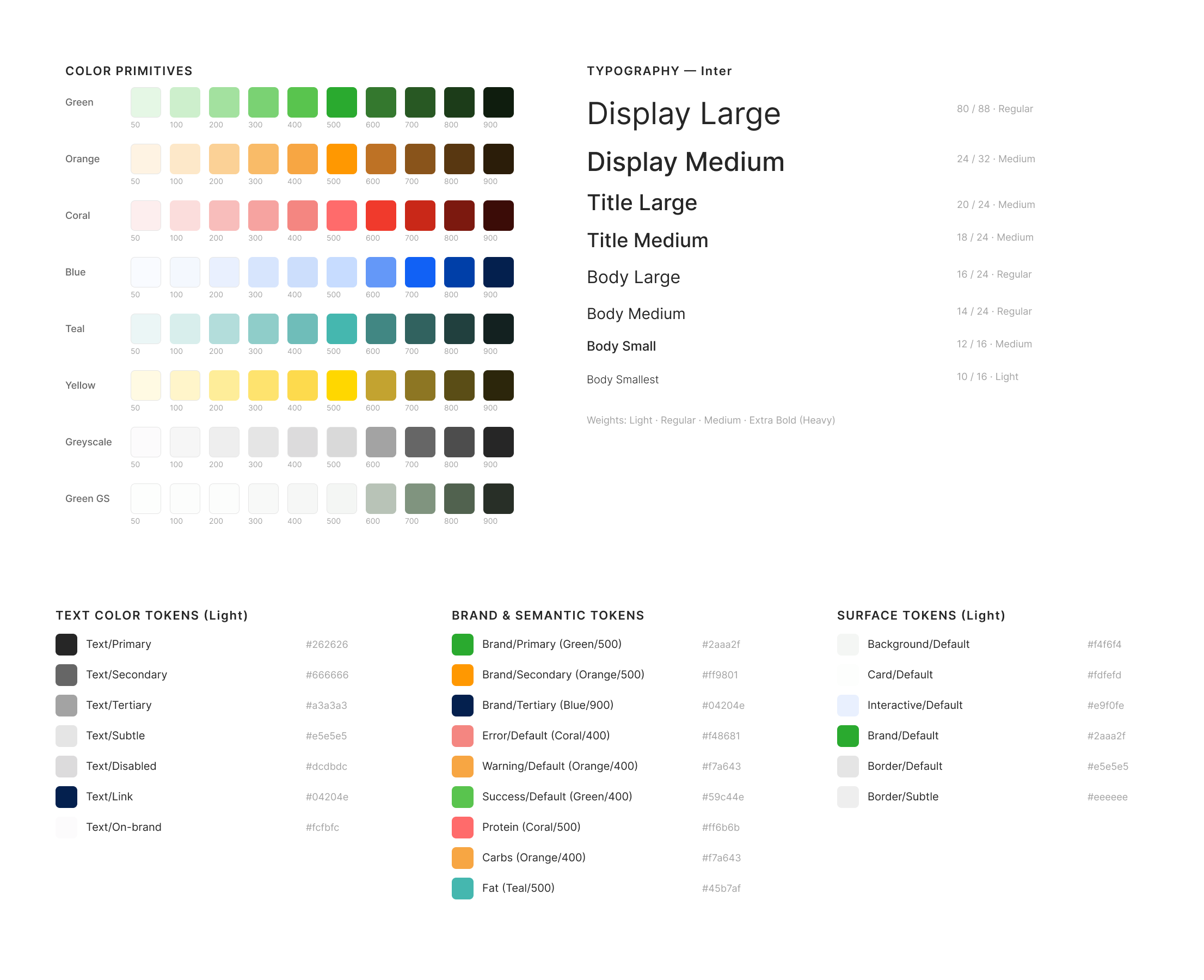
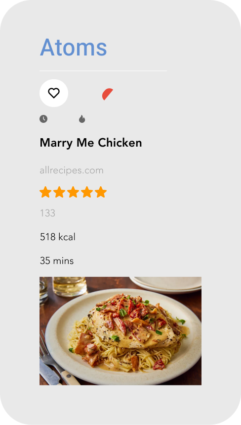
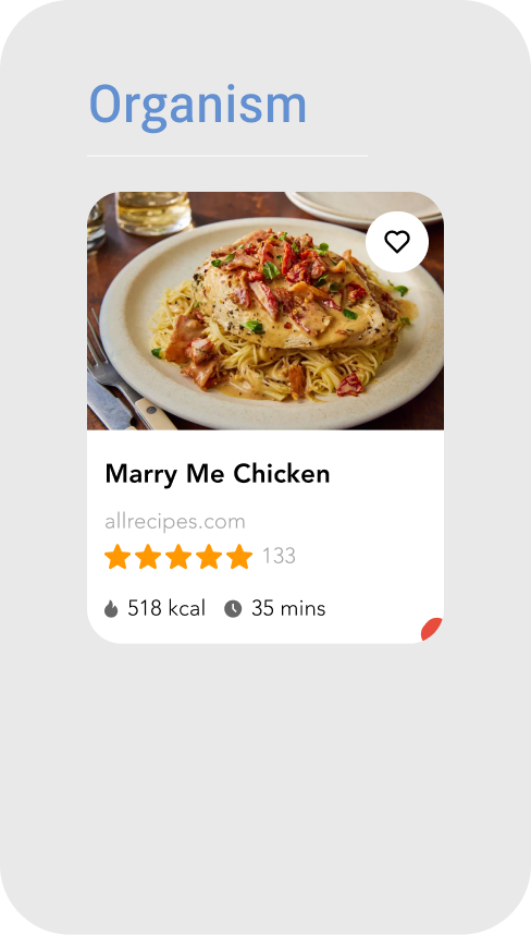
Component library
Components follow atomic design. Small pieces (icons, text, stars) combine into molecules (rating bars, metric rows), which combine into full organisms (recipe cards, nav bars). Every component pulls its colors, spacing, and typography from the token system.

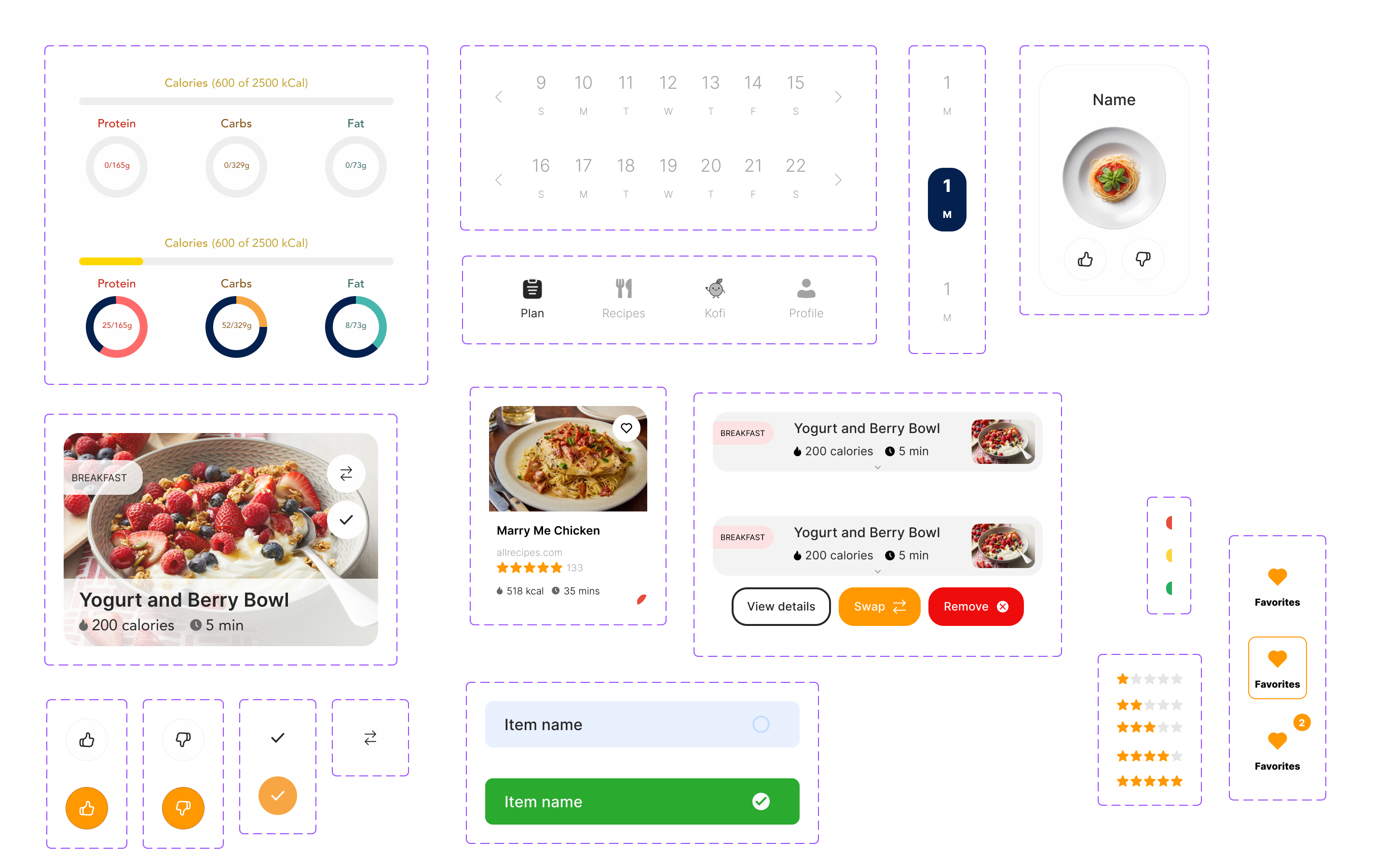
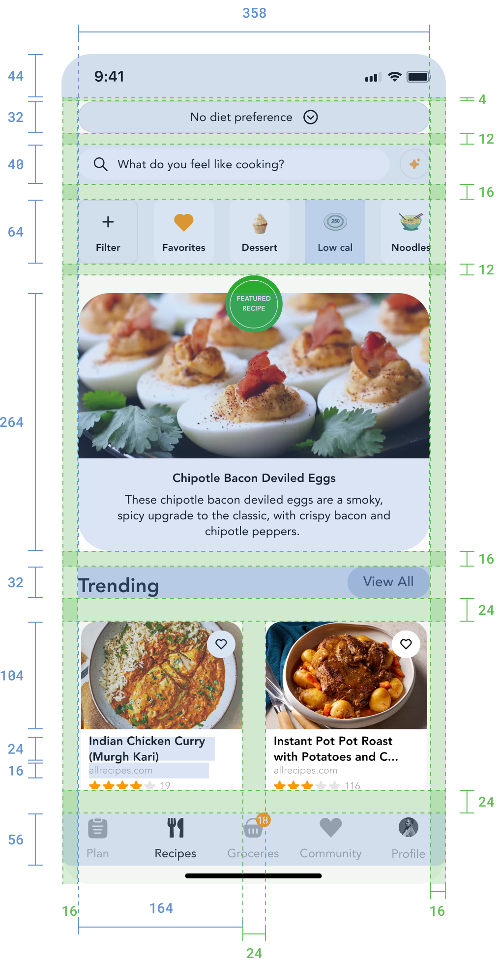
Spacing
Everything sits on an 8px grid. Component padding, section gaps, and touch targets are all multiples of 8. Touch targets are minimum 44px for accessibility.
If I could go back, I'd change three things.
The Design System.
I built the system, the tokens, and the components. What I didn't build was proper usage documentation. At a startup moving fast with a small team, building the system came first. But when I handed direction to the other two designers, they had the components without the rules. Next time, I'd write the guidelines alongside the system, not after.
Analytics.
I should have pushed harder to get analytics into the onboarding flow before launch. We know users drop off, but I can't tell you which screen or why. If I'd set up event tracking from the start, the design decisions after launch would have been based on data instead of guesses.
The Skip Button.
We removed the option to skip entering personal data like height and weight. Users had to provide it or they couldn't continue. That was too blunt. A confirmation modal explaining why the data matters and what they'd miss without it would have been more respectful of the user's choice.