A B2B fitness platform redesign. Dashboard, onboarding, and CMS in 3 months.
Two problems blocking growth.
JetSweat is a B2B SaaS platform for fitness studios. Studios couldn't try the platform before buying. And every new customer required 3 hours of manual website setup by the ops team. One problem slowed acquisition, the other slowed scaling. I had 3 months to fix both.
No users to interview. So I studied the competition.
No existing user base to pull from and no research budget. I analysed 9 established fitness platforms to understand how they handle product-led growth, onboarding, and self-serve tools. Then I ran a heuristic evaluation of JetSweat's existing dashboard to identify where it was failing.
Three deliverables. One goal.
Dashboard redesign
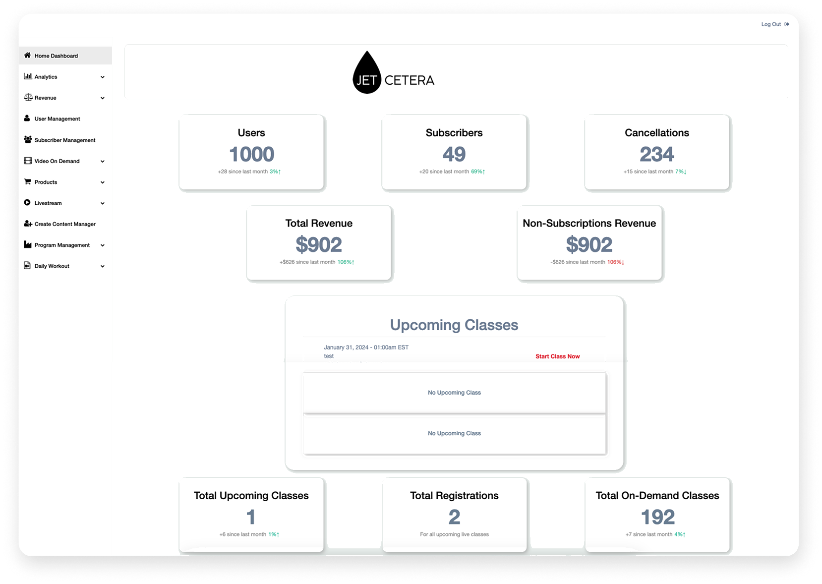
The original dashboard had poor visual hierarchy. Key metrics were buried, navigation was cluttered, hard to scan. I redesigned it following natural scanning patterns. Key metrics top-left where people look first. Revenue consolidated with charts. Navigation reorganised by frequency of use.
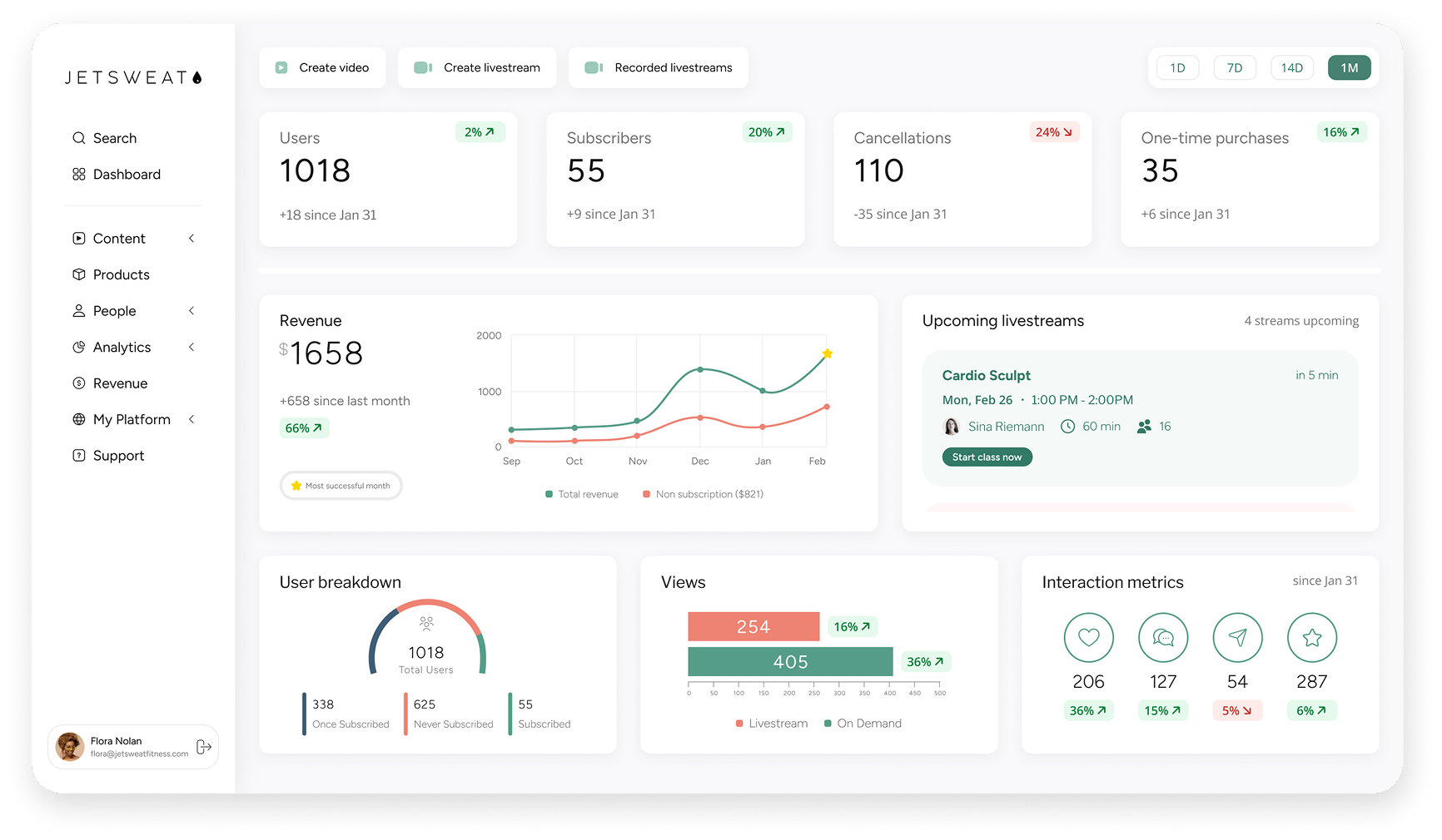
"Key metrics top-left." Eye-tracking research shows users scan in an F-pattern. Revenue, active users, and class completion rates move to the top-left quadrant. Everything else follows in order of importance.
Free trial onboarding
Designed a 5-step onboarding flow from scratch. Easy questions first to build confidence, personal and business details later. Studios could evaluate the platform on their own without needing the sales team involved.
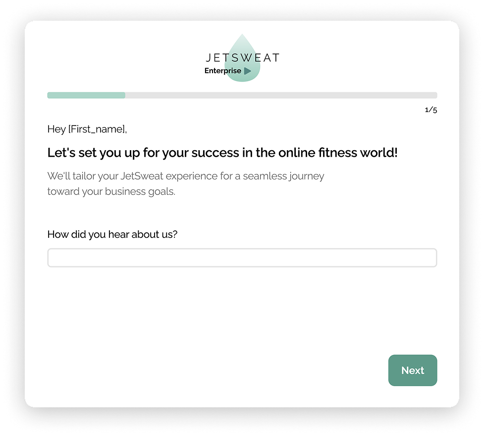
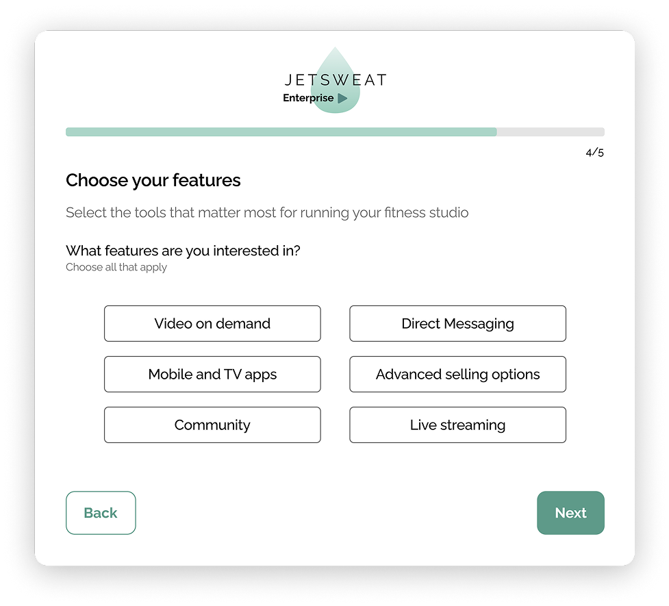
"Easy questions first." Name and studio name before business details. Builds momentum before asking for anything sensitive. By step 3, the user is invested.
Self-serve CMS
Studios needed their own websites. The ops team was building each one manually. I designed a self-serve website builder with form fields and drag-and-drop uploads. A visual preview showed how content would look on the final site.
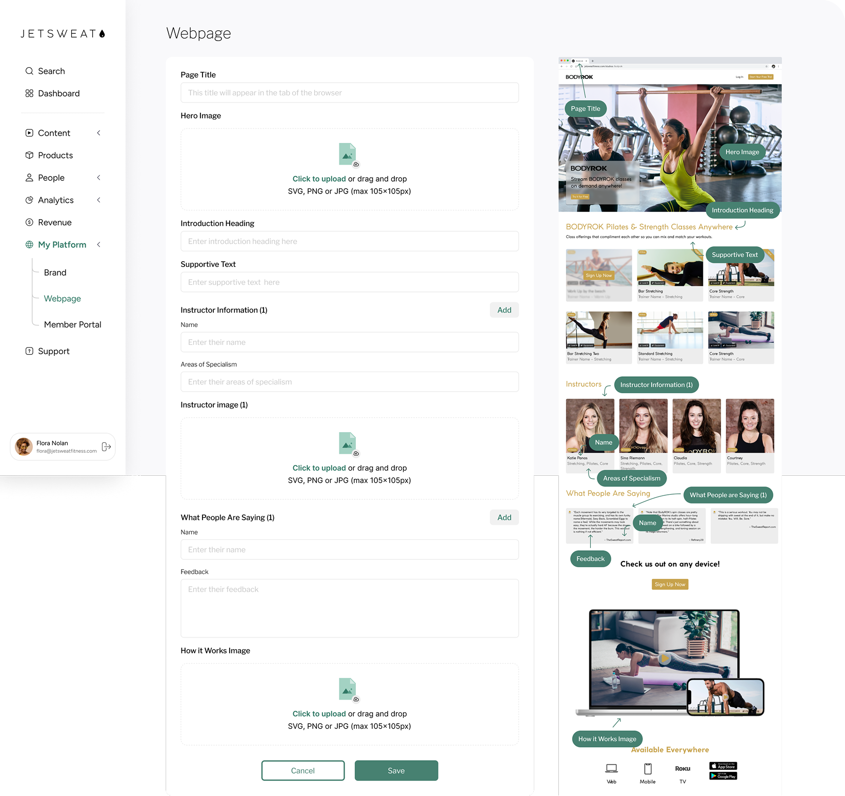
"Live preview, not imagination." Studios see their content rendered in real-time as they build. No guessing what the final site will look like. Reduces revisions and support tickets.
What changed.
"The new dashboard is so much cleaner and easier to scan. Users can see important metrics at a glance instead of hunting through menus."
"The CMS solution was exactly what we needed. Studios can now build professional sites themselves, which frees up our team to focus on growth."
What I'd do differently.
This project taught me that competitive research and heuristic evaluation can get you to solid solutions when you can't do primary user research. But I'd push harder for even a few user interviews. The dashboard and CMS were built on sound UX principles, but without real user validation, there's always a gap between what you think works and what actually works.
Competitive analysis is a starting point, not a destination. It tells you what the market does. It doesn't tell you what your users need. The solutions were built on sound principles, but I'd push harder to get in front of real users earlier, even informally.